.jpg)

Your subscription widget is the one spot on the page where a one-time buyer turns into a recurring customer. So it's worth getting right. The best ones all do three things: they make subscription the default, they show savings in real dollars, and they let the shopper answer three questions in about two seconds — how much do I save, how often do I get it, and how easily can I get out.
Most stores don't treat it that way. The widget ends up as a plain radio button that says "Subscribe & Save 10%," bolted on and forgotten. The brands growing subscription revenue fastest treat it as their highest-leverage surface on the page, because small changes here compound into big revenue differences over a year. This guide walks through the design, copy, and layout decisions that separate a high-converting widget from the default one — with six real product-page teardowns to show you what that looks like in the wild.
A subscription widget is the module on a Shopify product page where a shopper picks between a one-time purchase and a recurring "Subscribe & Save" plan. It's where they choose their delivery frequency, see the subscriber price, and start the subscription. Because it's the moment a single sale becomes recurring revenue, its design has an outsized effect on how many shoppers actually subscribe.
Here's the simplest way to judge a subscription widget before you get into specifics. A shopper should be able to answer three questions within two seconds of seeing it:
If a shopper has to scroll, click, or do math to answer any of these, the widget will underperform. Every principle below serves this test.
Pre-selecting subscribe is the single biggest lever you have. Think about what the alternative asks: if one-time is the default, every shopper who wants to subscribe has to actively switch to it — and most people just take what's already selected. In Loop's teardown of six live widgets, five of six pre-select subscribe. One-time is still there, but it's dimmed, renamed "Try Once," or pushed below.
The results are documented, and it's worth being precise about what caused what. Live Bearded's case study attributes a 130% lift in subscription conversions to the default change specifically, with no drag on overall site conversion. That was one part of a bigger push that took subscription revenue from 5% to 20% of total revenue in nine months — a benefits page and a rewards journey did the rest. NutriPaw tells a similar story: defaulting to subscribe was one of several moves — alongside clearer savings, flexibility copy, and win-back campaigns — that grew its subscription revenue from 5% to 28.6% of total revenue and lifted first-time subscription orders from 4% to 18–20%. In Loop, you can set subscribe as the default in the widget settings.
"Save 10%" makes the shopper do math. "Save $4.99 every month" doesn't. The widgets that convert best show the subscription price and the one-time price side by side, with a strikethrough on the higher one, so the exact dollar savings are right there. In Loop's teardown, goodprotein, MaryRuth Organics1, and Four Sigmatic all show the struck-through full price next to the subscriber price.
The strongest ones go a step further and restate the price in the unit the shopper thinks in — per serving, per cup, per day. Four Sigmatic, for example, shows a per-serving price ($1.08 vs $1.54) right next to the pack price. Reframing a big lump sum as a small per-use number turns a $40 bag into about a dollar a cup, which is a much easier yes.
Here's a pattern that shows up in every strong widget: the first-order discount and the recurring discount are shown separately, so the ongoing price is never a surprise. goodprotein spells out "40% off your first order" and "20% off all recurring orders" as two ticks, and Four Sigmatic discloses both its 30% first-order and 20% recurring rates inside the box.
You can take it further by giving shoppers a reason to commit harder — a steeper discount for a longer term or a bigger pack — so the upgrade happens right inside the widget, which lifts both conversion and lifetime value. And across the teardown, the value almost always runs past the discount: a free gift (Beam's $14.99 frother), rewards points (MaryRuth Organics), free shipping (OSEA). The discount shouldn't be the only reason to subscribe.
Shoppers hesitate to subscribe when they're worried about getting stuck — and every widget in the teardown answers that worry right in the box, not on some separate FAQ page. The cancel terms sit next to the price: "skip, pause, or cancel anytime," with any minimums (like goodprotein's two-order minimum) stated plainly too. Good micro-copy reads "skip anytime," "cancel anytime," "pause in one click," or "edit your delivery schedule online," and a small "?" tooltip lets the cautious shoppers dig in without cluttering things up. Loop supports pause, skip, and swap messaging in the selector, and the customer portal delivers on it with self-serve management — so the copy is the real experience, not just a promise.
An out-of-the-box widget is built to work for everyone, which means it's optimised for no one. It sits on the page looking like a third-party add-on that doesn't match your store. The fix is to match your fonts, corner radius, button styles, colours, and spacing to the product page. In Loop, you can customise the widget with a built-in CSS editor and controls for fonts and font sizes, button styles, colours and gradients, padding and margins, layout, and hover states. If you want to go deeper, Loop's custom widget gives you full control over layout (vertical or horizontal), copy, and hover states through a one-click installer — no developer needed for most of it.
One shift worth copying from the strongest teardowns: use cards, not bare radio buttons. When "Subscribe & Save" is a styled card that holds the savings badge, the frequency, and the flexibility copy all in one place (goodprotein and DIME Beauty both do this), it reads like a curated choice instead of a checkout form.
A widget that looks great on desktop but breaks on a phone lets down every shopper who's on one. So design for the phone first. The priorities:
Loop's widget is responsive out of the box, and you can preview changes on mobile in the theme customiser before you publish.
"Subscribe & Save" is fine, but it's generic — it names the mechanism, not the benefit. The brands with the best widget conversion rename the plan to say what the customer's getting: "Monthly Refill" for a consumable, something like "The Ritual" for wellness, or Loop's own example, "Join the Refill Crew." Choosing a named plan feels like joining something. Clicking "Subscribe & Save 10%" feels like signing a contract. The teardown shows the same lever used in reverse, too — Beam and Four Sigmatic rename the one-time option "Try Once" (and label it "SAVE 0%") so subscribe looks like the obvious pick. It's a zero-cost change you can make in Loop's widget text settings in a few minutes.
For discovery-driven categories — beauty, wellness, coffee, pet food — letting a customer pick a few products and subscribe to the whole bundle in one click often converts better than subscribing to a single SKU. AOV tends to rise because they've committed to more, and the subscription usually sticks better because the bundle feels like theirs. Loop's bundle builder handles both build-your-own and preset bundles, and it routes straight to checkout so the shopper subscribes in one flow instead of bouncing to another page. The move that makes it work: put the quantity or bundle choice before the plan, so quantity anchors the price before the subscribe decision even comes up.
The product page is home base, but it isn't the only spot that works. A badge on the collection page signals the subscribe option before the click. A cart-drawer prompt ("switch to Subscribe & Save and get 15% off") gives a second chance to opt in. And dropping the widget straight onto a paid-traffic landing page keeps the path short. Loop lets you add the widget to non-product pages too — collection pages, landing pages, featured product sections, and custom modals.
These come from a teardown of six live product-page widgets across protein, skincare, sleep, coffee, and daily vitamins. Each is a real, publicly visible storefront — the screenshot is exactly what shoppers see — with a note on what the widget is doing and why. They're snapshots captured in August 2026; the design patterns are what to copy, but check each brand's live page for current pricing.
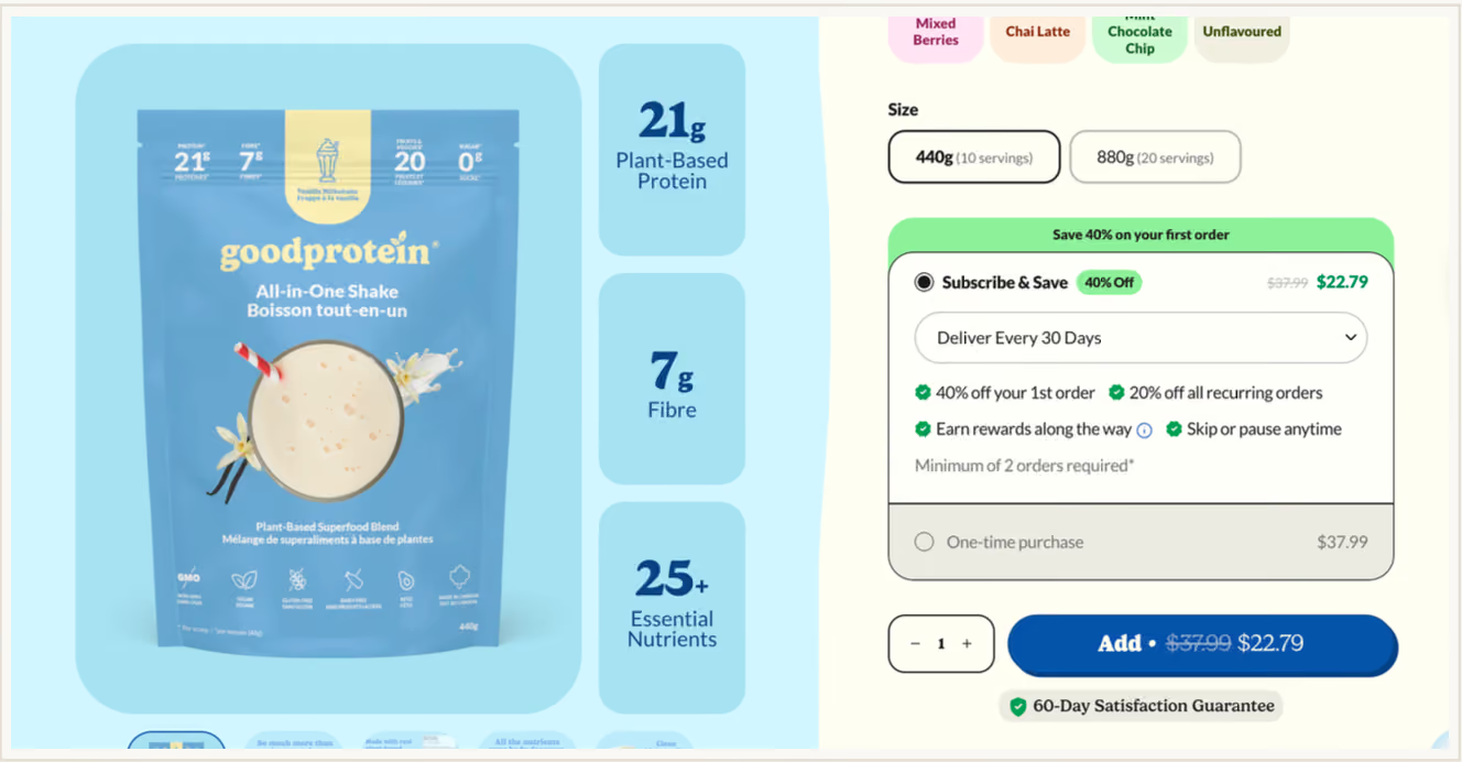
Subscribe & Save is pre-selected and one-time is greyed out. A banner carries 40% off the first order, and the box splits the deal in two — 40% off order one, 20% off every order after. Four benefit ticks (first-order discount, recurring discount, rewards, skip or pause) sit above a plainly stated two-order minimum.
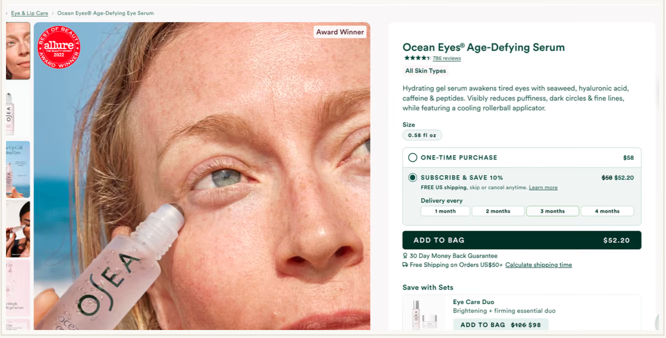
Subscription is the calm default, with delivery frequency shown as a four-tap strip (1–4 months) instead of a dropdown. The discount is a modest 10%, so the value story leans on free US shipping and "skip or cancel anytime" rather than price.
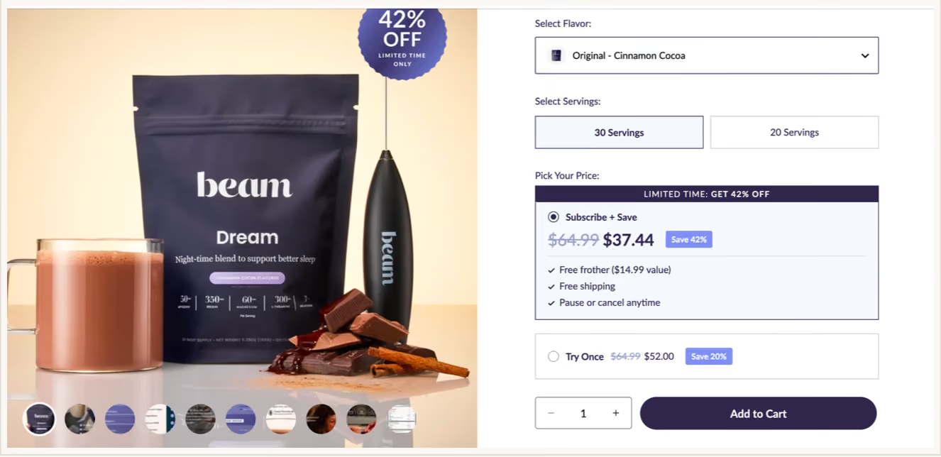
Framed as "Pick Your Price." A limited-time 42% off bar sits on the subscribe option, and the hook is a physical gift — a free frother with a stated $14.99 value. One-time is renamed "Try Once" and still carries 20% off, so nobody leaves empty-handed.
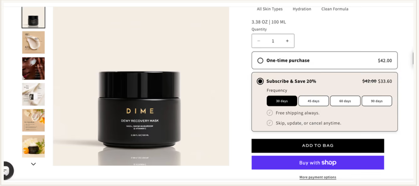
A sparse layout — two rows, a frequency strip out to 90 days, and two ticks (free shipping always; skip, update, or cancel anytime). 20% off is the only number in the box, so the discount does the persuading on its own.
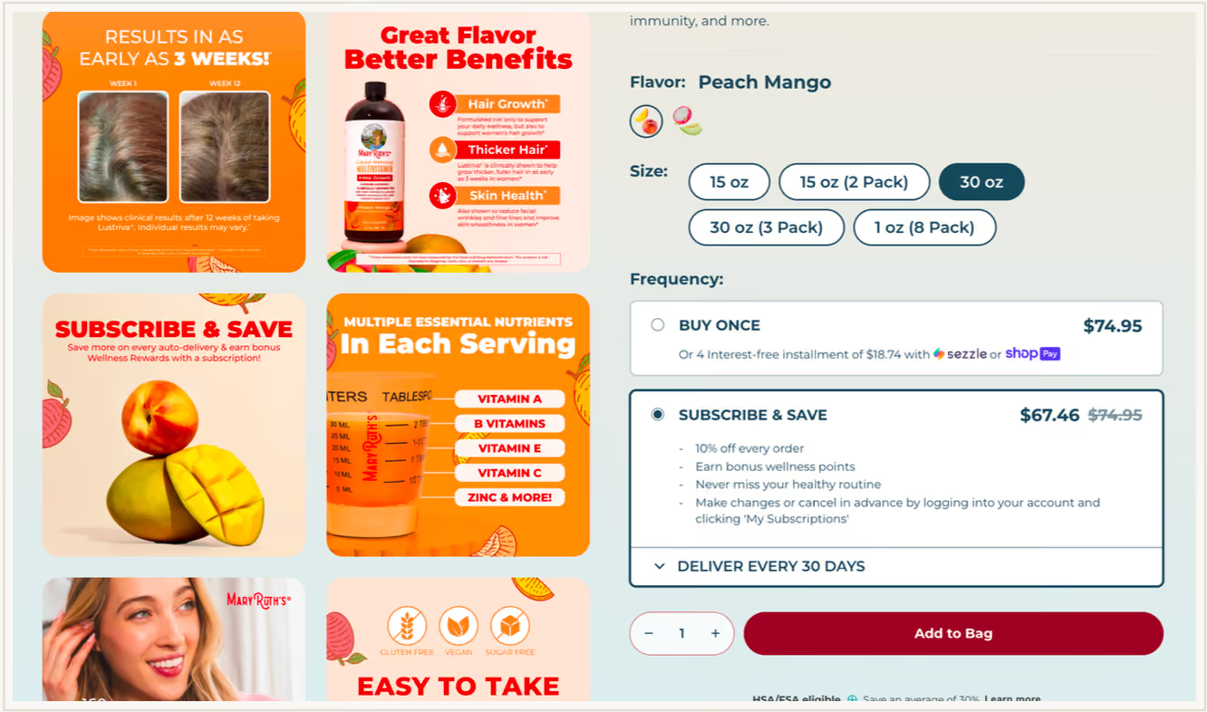
Five size and pack options are laid out as a grid before any plan is chosen. Buy Once leads with instalments; Subscribe & Save shows the discounted price in large type, with the full price struck through beside it; and loyalty is part of the pitch — bonus wellness points on top of 10% off every order.
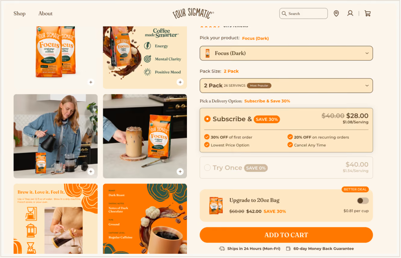
Product and pack size are dropdowns, keeping a wide catalogue on one page. Subscribe shows a per-serving price ($1.08 vs $1.54), one-time is labelled "Try Once — SAVE 0%" and dimmed, and both the first-order (30%) and recurring (20%) discounts are disclosed inside the box.
The Patterns That Repeat Across the Six
Want to see these patterns in more live storefronts? Browse Loop's subscription widget template gallery — real widget, bundle, and customer-portal designs from top Shopify brands you can model yours on.
Your widget isn't set-and-forget. The main number to watch is the subscription opt-in rate — the share of product-page visitors who pick subscribe over one-time. Treat documented results as reference points, not guarantees, since every brand's number reflects its own mix of changes: NutriPaw's first-time subscription orders rose from 4% to 18–20% as it moved to a subscribe-default widget (among other changes), and Live Bearded's case study ties a 130% conversion lift to the default itself.
Just as important, watch what happens to those subscribers after they sign up. A subscribe default should lift opt-ins without spiking early churn — Live Bearded's held at 3%. If churn does jump, your copy is creating accidental subscribers, so fix the clarity, don't drop the default. From there, test the things that actually move the number: the discount threshold (find where opt-in stops climbing so you're not giving away margin), your copy (plan name, savings framing, button text), and how many frequency options you show. Loop's subscription analytics dashboard tracks widget conversion next to churn, LTV, and revenue, so you can tell whether a change is winning you keepers or just sign-ups.
Live Bearded grew subscription revenue from 5% to 20% of total revenue in nine months — and that came from several changes working together, not one. Defaulting to subscribe lifted subscription conversions by 130%. A benefits page shown on cancel saved 9% of would-be cancellations. A visual rewards journey in the customer portal cut first-order cancellations from 50% to 40%. Through all of it, average churn held at 3%.
NutriPaw grew subscription revenue from 5% to 28.6% of total revenue over nine months, and lifted first-time subscription orders from 4% to 18–20%. Again, it was a stack of changes, not a single switch: subscribe set as the default, stacked value (a base discount plus free shipping and VIP perks), flexibility copy in the widget, and Klaviyo win-back campaigns that reactivated 40% of cancelled subscribers.
Four Sigmatic grew its offer save rate about 90% between April and August 2025 (4.84% to 9.55%). The lever there was specific: it swapped a single 20%-off offer for three at once — a discount, a free product, and free merch. That's a cancellation-flow metric, not a widget one, but it makes the point that the whole subscription experience, from the widget to the cancel page, works as one system.
Want more inspiration? Loop has published a gallery of 12 subscription widgets showing how brands across supplements, coffee, pet food, and skincare style their subscription experience.
Your subscription widget is the one point where a one-time buyer becomes a recurring customer. The brands converting best do three things: they default to subscribe with the dollar savings visible, they answer the lock-in worry with flexibility copy inside the widget, and they make the whole thing feel native to their brand instead of bolted on. If a shopper can answer "how much will I save, how often do I get it, and how easily can I get out" in about two seconds, your widget will convert. If they have to scroll, click, or think, it won't.
Q. What is a good subscription opt-in rate for a Shopify widget?
It depends on your product, your discount, and whether subscription is the default, so there's no single benchmark. Use real results as a guide instead: NutriPaw's first-time subscription orders rose from 4% to 18–20% as it moved to a subscribe-default widget (alongside other changes), and Live Bearded ties a 130% conversion lift to the default itself. If your rate is low, the widget's design or placement is usually the bottleneck before the product or the offer is.
Q. Should I default to subscription or one-time purchase on my product page?
For repeat-purchase products — supplements, coffee, skincare, pet food — default to subscription. It's the biggest single lever you have: Live Bearded's case study attributes a 130% lift in subscription conversions to the default change, and its churn held at 3%. Keep it honest, though: the savings should be clear, the one-time option should still be easy to pick, and "cancel anytime" should be visible. If defaulting spikes early churn, you're creating accidental subscribers — fix the copy, don't drop the default.
Q. How do I make my subscription widget match my Shopify theme?
Use your app's customisation tools to match fonts, colours, corner radius, button styles, and spacing to the product page, so the widget reads as native instead of bolted on. Loop's widget has a built-in CSS editor plus controls for fonts, button styles, colours and gradients, padding and margins, layout, and hover states — and a custom widget option for full layout and copy control with no developer. Moving from bare radio buttons to styled cards is one of the highest-impact visual changes you can make.
Q. How should I optimise my subscription widget for mobile?
Three things. Make every button and selector big enough to tap comfortably. Stack the options vertically instead of side by side. And keep everything in one column so there's no horizontal scrolling. Then collapse the frequency options down to the default, turn on express checkout (Apple Pay, Google Pay, Shop Pay), and preview it on mobile in your theme customiser before you publish. Plenty of your shoppers are on a phone, so a desktop-only widget lets them down.
Q. Is "Subscribe & Save" the best copy for a subscription widget?
Not always — it names the mechanism, not the benefit. Brands that convert better rename the plan to match the experience ("Monthly Refill," "Join the Refill Crew," or something category-specific), and pair it with dollar savings ("Save $4.99") instead of a bare percentage. Some also rename the one-time option "Try Once" so subscribe looks like the obvious choice. These are zero-cost changes you can make in Loop's widget text settings in minutes.
Q. Can I add a subscription widget outside the product page?
Yes. The product page is the main spot, but strong stores also put subscription messaging on collection pages (a badge on the product card), in the cart drawer ("switch to Subscribe & Save for 15% off"), and on landing pages built for paid traffic. Loop supports widget placement on non-product pages including collection pages, landing pages, featured product sections, and custom modals.